Bydly Insights
Explore the latest news, trends, and insights across various topics.
Responsive Web Design: When Pixels Play Hard to Get
Unlock the secrets of responsive web design and learn how to conquer those elusive pixels for stunning, user-friendly websites!
Understanding Media Queries: The Key to Responsive Web Design
Media queries are an essential component of responsive web design, allowing developers to create websites that adapt seamlessly to various screen sizes and devices. By using CSS media queries, you can specify different styles for different environments, ensuring an optimal user experience across smartphones, tablets, and desktops. This adaptability improves usability and accessibility, vital components in modern web development.
To implement media queries effectively, you should understand how to structure them. A typical media query consists of a media type, followed by one or more expressions that check for specific conditions, such as width or height. For example, using the following code snippet:@media (max-width: 600px) { body { background-color: lightblue; } }
will change the background color of the body when the viewport width is 600 pixels or less. This flexibility is what makes media queries the cornerstone of responsive web design.

Common Challenges in Responsive Web Design and How to Overcome Them
Responsive web design often presents several common challenges that can hinder a seamless user experience. One major issue is the inconsistency in how various browsers render responsive elements. For example, an element that looks perfect in Chrome may appear distorted in Firefox or Safari, leading to discrepancies in layout and navigation. To overcome this, designers should utilize browser testing tools like BrowserStack or CrossBrowserTesting to identify and rectify display issues across different platforms.
Another significant challenge is the performance of responsive websites, particularly on mobile devices with limited bandwidth. As websites become increasingly complex with high-resolution images and multimedia content, they can take longer to load on slower networks. To address this problem, developers should implement responsive image techniques, such as the srcset attribute and lazy loading, which help to ensure optimal loading times and a smoother experience for users. By focusing on these strategies, web designers can effectively tackle the challenges of responsive design.
Why Your Website Needs to Be Responsive: Enhancing User Experience Across All Devices
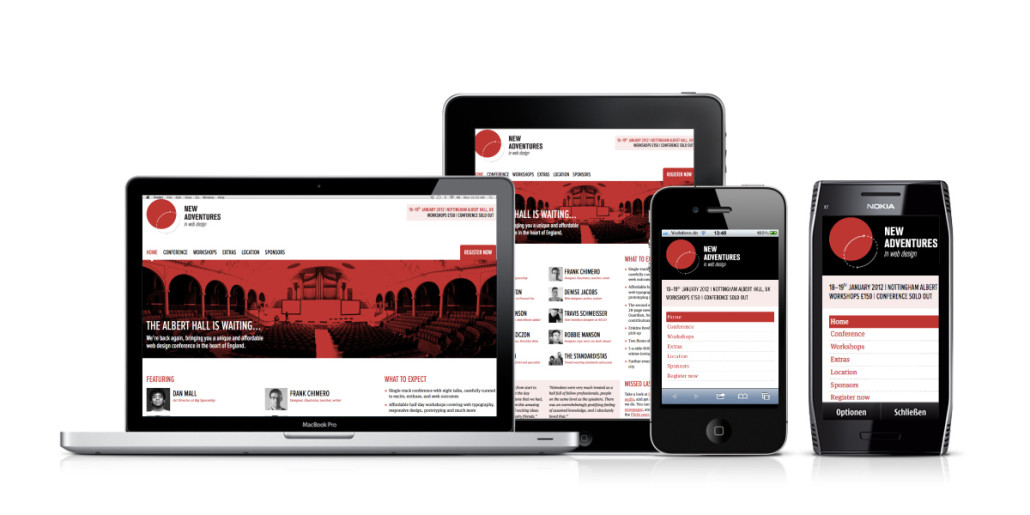
In today's digital landscape, having a responsive website is no longer optional; it’s a necessity. With the increasing use of mobile devices, tablets, and laptops, users expect a seamless experience regardless of the device they are using. A responsive design automatically adjusts to different screen sizes, ensuring that your content looks great and is easy to navigate on any device. This not only enhances the overall user experience but also helps to reduce bounce rates, as visitors are more likely to stay and engage with your content when it’s displayed effectively.
Moreover, search engine optimization (SEO) is significantly impacted by your website's responsiveness. Google prioritizes mobile-friendly websites in search results, which means that a responsive website can boost your visibility and drive more organic traffic. By optimizing your site for various devices, you not only improve your rankings but also instill trust and credibility with your audience. In summary, embracing a responsive design enhances the user experience and positively contributes to your website's success in a competitive online environment.